I joined the Nuun Hydration design team in April of 2020. During my time at Nuun Hydration, I had the incredible opportunity to contribute my design skills and expertise as a part of the Design and Marketing team that not only pushed the brand's visual identity forward, but excelled in the rapid shift to digital and video in 2020 and beyond. As one of the designers, I specialized in digital design, from iterating and collaborating on social media advertising, to expanding upon and applying campaign concepts across channels and deliverables. Blending form and function, I crafted innovative designs that captured the essence of the brand and resonated with our various target audiences. By incorporating vibrant colors, clean typography, and captivating imagery, I elevated Nuun's image, making it stand out in a competitive market. Collaborating closely with an incredible cross-functional team including designers, copy-writers, marketing stakeholders, coordinators, and project managers, I ensured that the brand's message and visual assets were cohesive across all channels, from the website to social media platforms. It was an immensely rewarding experience to combine my passion for design with the mission of promoting healthy hydration, and I am proud to have played a role in the brand's success.
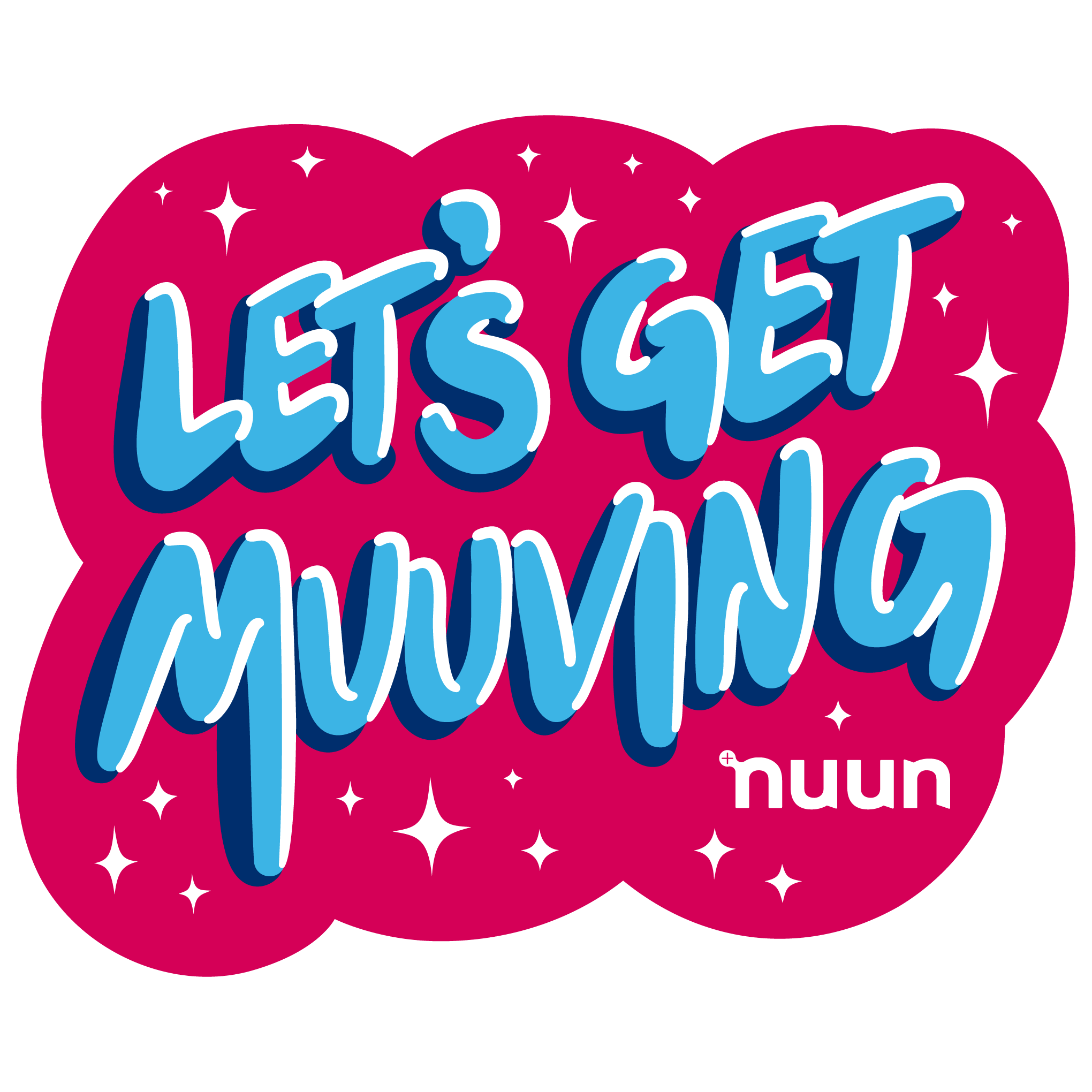
Let’s Get Muuving Illustration
I created this illustration, starting first in Procreate on an iPad to move quickly and creatively for a quick piece. After it found success and popularity, we wanted to use it on more things, so I brought it in to Illustrator and vectorized it and cleaned it up. This was then turned into stickers and printed on swag such as fanny packs, t-shirts, water bottles and more!
Giphy Stickers
I often created fun little GIFs like these to be uploaded to the Nuun Giphy account, for the Nuun social media to use as well as for brand partners, influencers, and athletes to use to promote and be on-brand on social media. Using Procreate, I was able to quickly sketch and put together playful animations that people would be excited to use, that were connected to campaigns or were general Nuun branded Giphy stickers.
Motion ads
This is a paid ad for social feeds on Instagram and Facebook. It is designed to promote the Nuun+ Loyalty club. Since videos in the feed will loop, this is designed to seamlessly loop. The video utilizes bright colors and a fun song, in order to be “thumbstopping”. I show the Nuun product, logo, and headline all within the first few seconds, because you only have a moment to catch a viewer’s eye while they scroll their social media feed. At the end of the video, there is the logo once again, as well as a clear Call To Action. This campaign also uses the Nuun+ Loyalty club sub-branding which includes the “more more more” circles.
This is a paid ad for Instagram stories, intended as a bottom of the funnel conversion ad, to promote the Muuv with Nuun: Run with Ryan bundle. I designed it to be simple, eye-catching, and highlight that it’s a good deal. There is clearspace at the top and bottom of the screen, leaving room for elements that will be overlaid in the Instagram interface. The important information is shown to the viewer right away, so that they don’t have to wait to the end of the ad, because many viewers are tapping through their story quickly. I chose a fast-paced and pumped up song for this campaign, because the audience is for runners, both new to running and intense endurance runners, so the song needed to be fun and not too intense so as to be intimidating. This campaign uses the Muuv with Nuun subbrand, and specifically the MWN Run style, of stop-motion and gif-like animations.
For the awareness part of the Muuv with Nuun: Run with Ryan Hall campaign, I utilized our MWN branding in combination with video and stop-motion photography assets to create this exciting ad for Instagram and Facebook feeds. The goal here was to create interest in the free training program.
Every month, Nuun ran a short, medium-scale promotional campaign. These were a great lower-stakes opportunity for iteration and creative exploration, beyond the general Nuun brand and without a strict subbranding that a larger campaign would entail. Here, I created a motion ad for Facebook and Instagram feeds. I designed it with bright colors, playful shapes, smoothly satisfying motion, and a seamless loop. Because the goal of the ad was conversion, it features product imagery that the team wanted to highlight: Nuun Sport and Nuun Instant, and shows shipping boxes to visualize that it is a free shipping promotion.
For the launch of Nuun Energy, we created a pumped up, high-energy campaign that combined “glitched” and distorted visuals with extreme sport athletes. I helped cut together video clips, select the music, develop the campaign visual style, do the motion design and static designs for ads, and the landing page,.
This is a motion ad I created for Nuun’s 2021 Black Friday / Cyber Monday promotional campaign. I chose a fun, friendly song that would appeal to the general Nuun audience. After testing, we had begun to learn that it was important to show the product visually, not just the tube packaging, but the tablet in water, for new-to-Nuun viewers to understand what the product is. For this reason, I made sure to include a water bottle in the ad. We had also found that big bold lettering, in combination with bright colors that showcase the flavorful drink help designs to resonate with customers.
Another monthly promo ad, I had the opportunity to use some creative freedom and take a chance on a riskier design. The promo this month was for a free bottle. I had available to me 360 stills of the Cali bottle, so I brought them together into a stop-motion to make the bottle spin. I grabbed the colors off the bottle design to really make it shine, and utilizing some simple liquid effects on text, I made this ad. There was some internal concern about whether it was on-brand, but my creative director backed me up and we tried out the mini-campaign. It ended up performing incredibly well! We learned it can pay off to take a chance on bold, experimental designs in order to be truly thumbstopping.
Organic Social
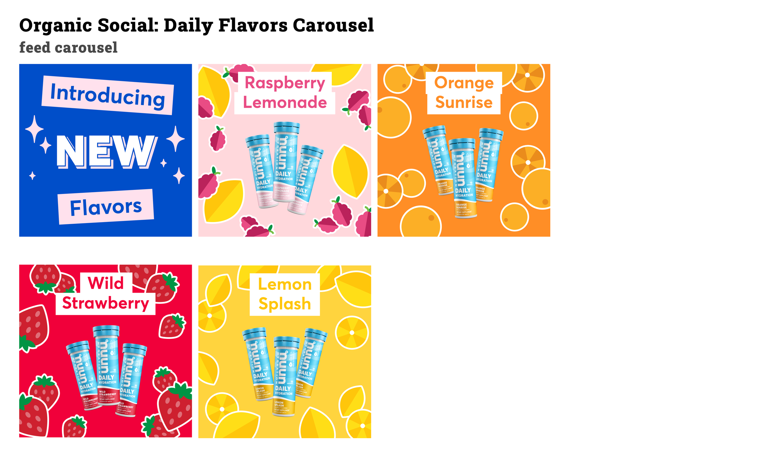
These are a sampling of social post designs and illustrations I created for Nuun. Each design reflects Nuun's brand identity, exuding freshness, vibrancy, and vitality. The illustrations blend a sporty look with a playful fruity touch, often utilizing visual trends of the moment. By incorporating organic elements like lush greenery, vibrant fruits, and refreshing splashes of water, I conveyed Nuun's dedication to health and wellness. I chose bright, playful color palettes engage Nuun's target audience while staying true to the brand's vision. I used existing brand assets including illustrations, patterns, and icons, as well as created new ones when appropriate. These designs helped make a lasting impression and took Nuun's online presence to new places.



Emails
A sampling of emails that I designed for Nuun. It is important to design for both mobile and desktop when creating emails, whether you make separate versions for the different sizes or you make one version that is legible on various size screens. Here, I played to the strengths of Nuun: bright fun colors, engaging lifestyle photography, bold product imagery, combined with icons and illustrations that help to tell the brand story. We tested and iterated to find the most successful designs, prioritizing engaging hero modules, bold call to action buttons, simple motion using GIFs when possible, and clear value proposition placement. Tap on an email to see the full view.
Landing Pages
Home Page Modules Wireframes
In summer of 2020, Nuun began the process of updating the DTC homepage. It had not been updated in several years and needed some improvements. One of the top priorities was to utilize modular sections that allowed easy and frequent site content updates by the Nuun team, without dev work. To begin this process we gathered inspiration from other DTC home pages and did some competitor comparisons. From here we determined which types of modules we would need, and associated inspiration for them. At this point, I created simple wireframes of all the module types we wanted built, to explain and illustrate their design to the outside dev and UX team. I fully set up a working prototype, in mobile, tablet, and desktop, in Figma, including contextual comments to explain nuances and questions I anticipated the dev team may have. See link below to view the wireframe prototype.

